Case study · Publishing.com Audit · Audit · UX + CRO · Education
Sample audit: what a five-part UX and conversion audit looks like
A worked example of how I audit a site, find where it loses visitors, and decide what to test first.
The problem
What was getting in the way
A site can look fine and still lose most of its visitors. This audit of Publishing.com shows how I look for where that happens and turn it into a short list of changes worth testing. It was an audit only, so it has no before-and-after results, and I use it as an example of the work I can do for clients.
The approach
How I tackled it
I audited the site in five parts: the website itself, the user experience, performance, conversion pathways, and the use of CTAs, popups and banners. Each finding came with a specific recommendation to test. Below, each screen is paired with what it was costing the site and what I would test first.
Key decisions
The calls that shaped the result
A clearer first screen
The only desktop CTA, "Watch Free Training", was tucked in the top right, and mobile had no visible CTA until the menu opened. I recommended a bold CTA in the hero, a sticky mobile CTA, and testing benefit-led headlines.
Shorter path to sign-up
I recommended renaming the main CTA (for example "Get Started"), putting the name and email form on the homepage, and sending the About page CTA straight to a form instead of back to the top of another page.
A lighter, faster site
Auto-playing animations and heavy imagery were weighing pages down, especially on mobile. I recommended compressing images, switching to interactive animations, removing unused code and plugins, and minifying files.
Popups, banners and quizzes
Beyond the page itself, I mapped places to catch visitors who were about to leave or unsure where to start: exit-intent popups, a sticky sidebar CTA, a top-of-page banner, urgency banners and a short quiz to point people to the right course.
The work
Selected screens
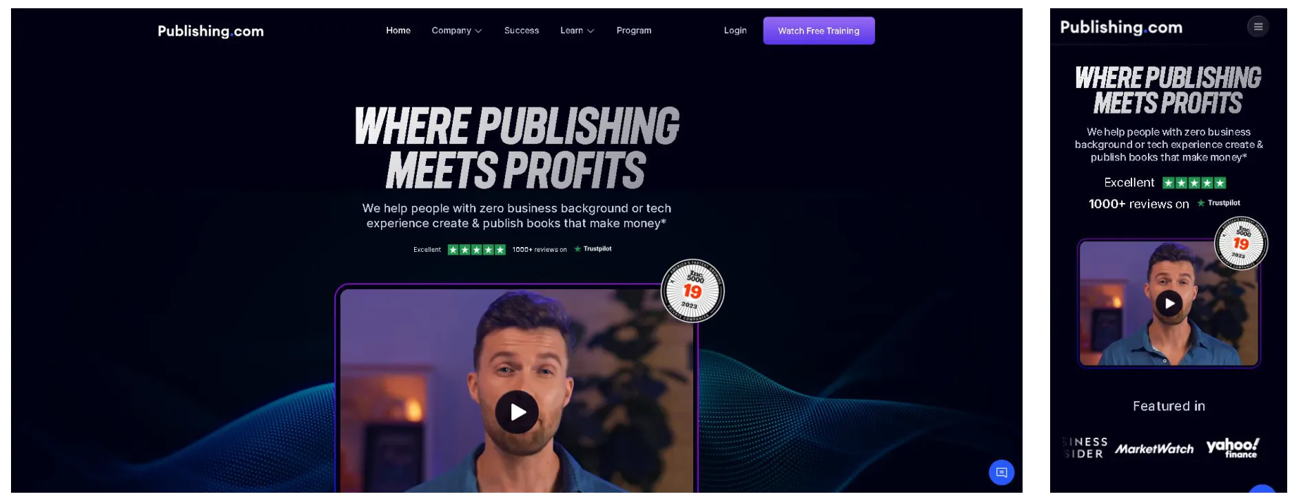
What it meant: The hero gives visitors one video and a single CTA, "Watch Free Training", tucked in the top right. There is no direct conversation pathway: anyone who is not ready to watch a video has no obvious next step, and on mobile the CTA is hidden behind the menu. I recommended a benefit-led headline, a bold CTA inside the hero, and a sticky CTA on mobile.
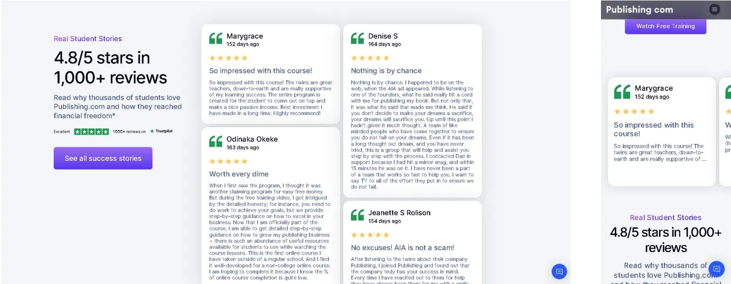
What it meant: The proof is there, but the reviews are long, hard to skim and sit away from any CTA, so trust is not showing up at the moment of decision. I recommended three or four recent, concise testimonials from people in their first one to three months, with star ratings or photos, placed next to the CTAs.
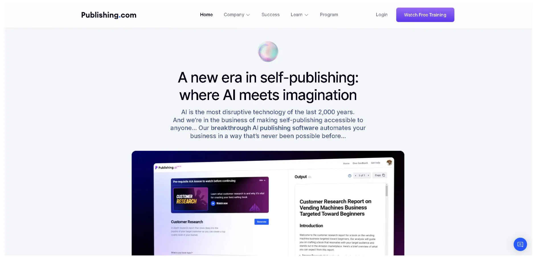
What it meant: Visitors have to read a dense paragraph to understand what the AI tool does for them, and nothing in the section invites them to try it. I recommended a three to five word heading, two lines of copy that state the benefit plainly, and a CTA, so someone skimming still gets why it matters and what to do next.
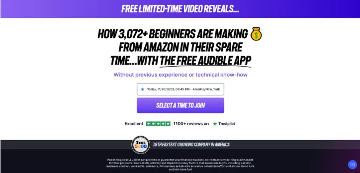
What it meant: The sign-up flow moves people along without telling them what happens next. I recommended renaming the entry CTA to "Get Started" and adding one line of supporting copy, such as "Complete your info and schedule your training at a time that works best for you", so people know what they are signing up for before they commit.
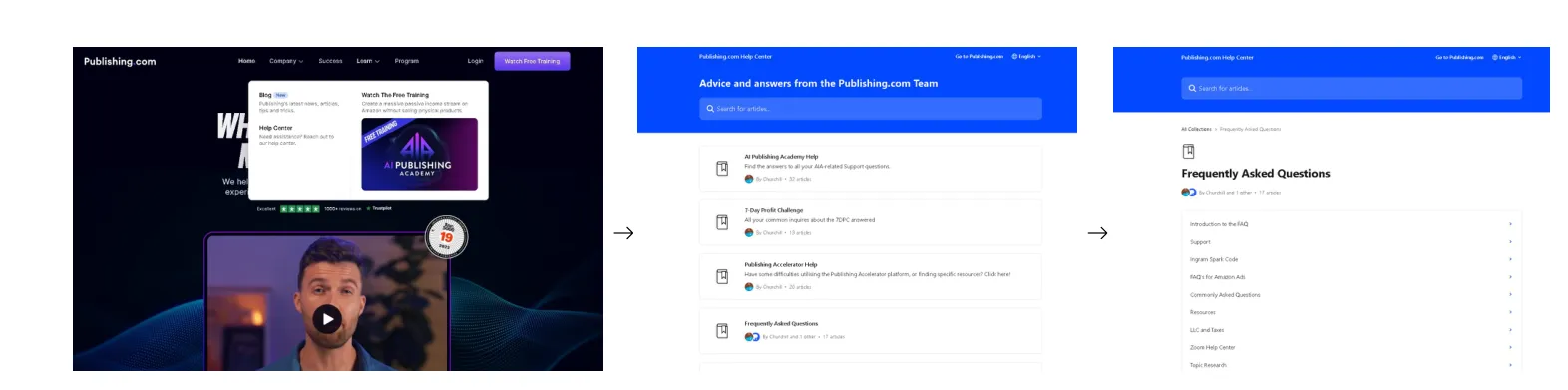
What it meant: Getting to the FAQ takes three steps through the menu and help centre, and none of those pages offers a CTA or a way to contact the team. Unanswered questions are lost conversions. I recommended adding the FAQ to the main navigation or footer, an email contact option, and a "Need more help? Contact us" CTA.
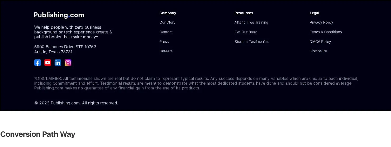
What it meant: The end of the page offers links but no next step, and the AI Publishing Academy sits so far down that many visitors never see it. I recommended moving it higher with a bold headline such as "Master AI Publishing Today", and renaming the training CTA "Unlock Your Free Training" so the action is obvious.
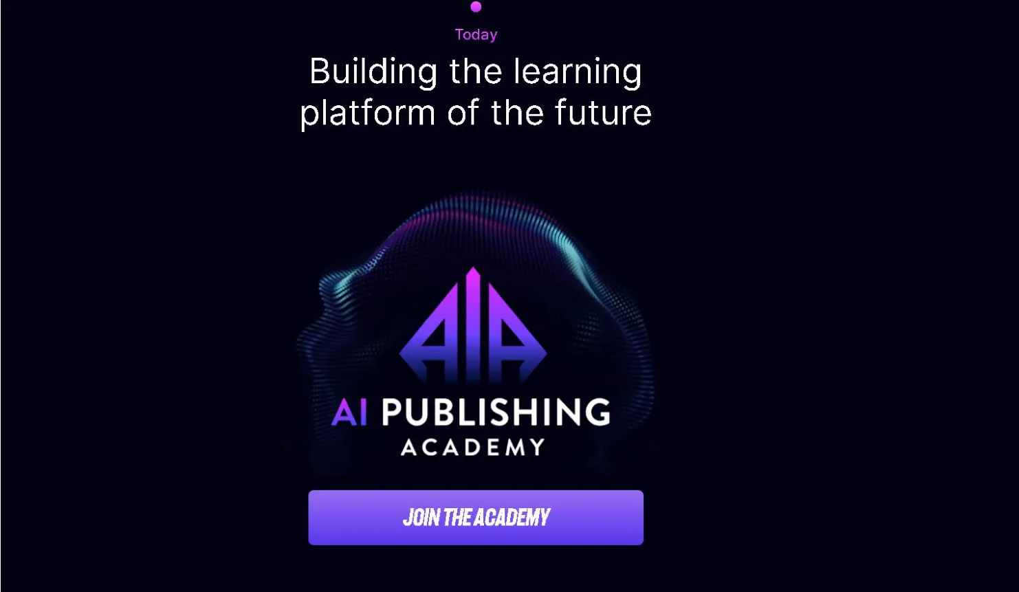
What it meant: On the About page, the CTA sends visitors to the top of a different page instead of to a sign-up form, which means extra scrolling and a moment of confusion. I recommended pointing it straight to a form or the next step, so the Academy promo leads somewhere in one click.
The result
What changed
The audit delivered a prioritised set of tests and fixes across all five areas, each with a clear recommendation. Want the same for your site? Get in touch and I'll tell you what an audit would cover.